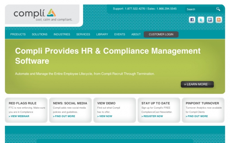
Compli.com is not only the corporate website for Compli -- a SaaS company in Portland, OR that specializes in Workforce and Compliance Management -- it's also part of the product because the website is so tightly integrated with the customer login experience. By automating our customers' workforce compliance, we like to say that they are able to sleep better at night, and we wanted a website that evokes this. It had to be soothing while providing a feeling of calm and confidence.
If we've done our job, you should feel better after viewing compli.com. We chose a color scheme that is associated with happiness and confidence, and went with a simple layout that abhors clutter.
On the tech side, before we chose Drupal we knew we needed to get away from the static HTML website we had in the past and that we needed a content management system that our marketing people could easily update to do this.
We compared many content management systems and eventually narrowed it down to Joomla and Drupal. In the end, Drupal turned out to be the best fit for us mostly because of the dizzying selection of add-on modules as well as the maturity of Drupal 6.
Because we have folks on staff who are capable of setting up and maintaining linux/apache web servers, we decided to host the site with Amazon Web Services so we could exercise total control over the server environment. Overall, we are overall extremely happy with the drupal+amazon solution. On a typical weekday we get upwards of 6000 hits to the site but the server never skips a beat.
Credits: Peter Nochisaki at 510interactive.com created the Drupal theme based on the original design by Jenn Huckins at MEAT (both from Portland, OR.) From Compli, Jonica Smith, Tim Egan, Chris Roberts-Olsen, Max Arbow and Kyle Walker all deserve a lot of credit as well. I (Joel Koberstein) served as project manager and as the server administrator.
Very nice. Love the integration of the buttons with the framework, very slick.
Thank you for making your site available for evaluation. I like the Idea of the design and the color scheme indeed makes you feel comfortable and does have the connotation to "happiness".
However, the site does not come out right, when I view it with my Firefox 3.6.3 on Mac OSX. I like to use a rather large "minimum font size" on my highres screen (you may call me visually challenged), so your menu bar pushes the customer login field into the second row, which places it in the way of the roll down menus.
Generally, all text flows over the border of the coloured fields, which makes the site look almost amateuristic in a way.
Removing the font size constraints, it comes out right. However, it might not be a good idea to assume certain font size settings at the clients/customer's side.
All the best!