
Take a look at our selection of educational websites which we compiled specially for the beginning of school year 2012. These are the sites of schools, colleges, museums and libraries, all powered by Drupal 6.X and 7.X.
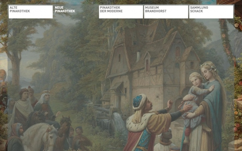
Reserved and classic design, just like the museum itself, yet with the modern feel. Muffled colours and straight lines, clear geometry without many details. Although, navigation options overlap content which may require scrolling.

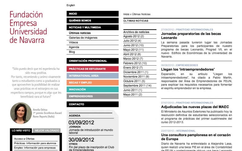
Magazine page layout where different sections are marked with different colours. This site has a well-thought, clear navigation which is very important for a site with many materials and mostly textual content. Its design is fresh and modern.

This website is a good example of subject and design being in tune. It has eco/healthy/recycle feel and look with its green and cardboard beige background, and it uses details in girly pink. Its minor drawback is too wide footer area.
Smart and concise, this site has distinctly European design with pops of bright colour. It is a selling site, but it sells not in a pushy, but in an informative way. The drawbacks: search field is not the most user-friendly, and the text size is a wee bit too small.
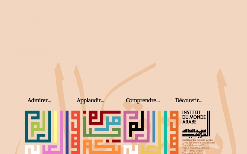
Interesting from design point of view, with distinct Arabic motifs and European feel, but not very user-friendly when it comes to navigation. Menu is too small and too invisible, background is somewhat distracting. Although, it is a good example of Drupal flexibility.
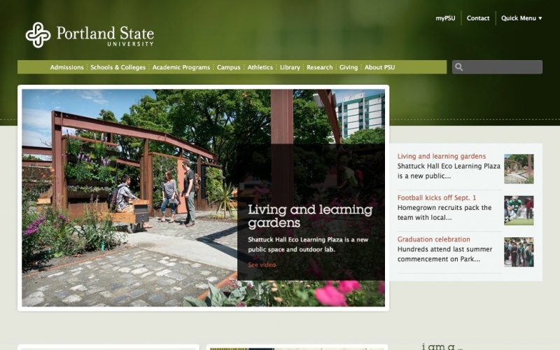
Well executed example of classic college site, North American style. Site that looks respectable enough for parents, and cool enough for the kids. Clean and clear design, very easy on the eye, and the navigation is predictable.
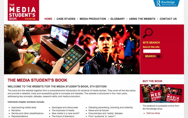
Newspaper-like layout, with content displayed in columns, and very few colours. Nothing is distracting visitors from the info they came to get on this site. Probable drawback: the menu appears too dense.

Visual, clear and well-crafted museum site which informs and educates through smooth and focused design. The text layout is practical to ease selecting and reading the needed info. The colour scheme is simple, so site content is always a main focus.
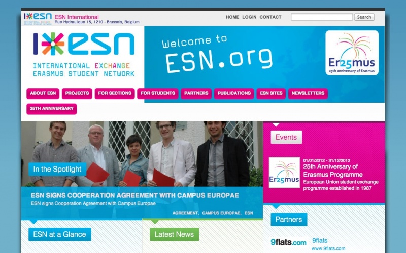
Bright colours and early 00s feel reminding of artsy and hip students on the one hand, and distinctly Drupal-y elements such as blue of the background and general geometry, on the other. A good example of combining information and design in a website, although a little bit out-of-fashion.

In order to boast popularity of drupal, it would be nice to have categories like "most famous" / "largest audience" web sites, listing the celebrities (world-famous TV / radio stations / newpapers / movies / music / ...)
I could not find a list of "top" sites in that sense. BTW, I also regret that it's not possible to sort "searche results" (listing of some category,...) by ranking (best votes...). Thanks !